Making Data Look Awesome Since 2021
What Does CraftusDo?
We get this question a lot: "So what do you do exactly?". Well, we make data come alive with stunning visuals that tell a story.
So let us tell the story about what we do and illustrate it with some applications that we've built.
And, to answer a popular question, these examples are not just dashboards built in Tableu. These are enterprise-grade SaaS systems automatically retrieving, processing, visualizing, and publishing data in near-realtime.
Most importantly, these projects were built in weeks, not years.

Explore the United States with Craftus US Counties Analytics
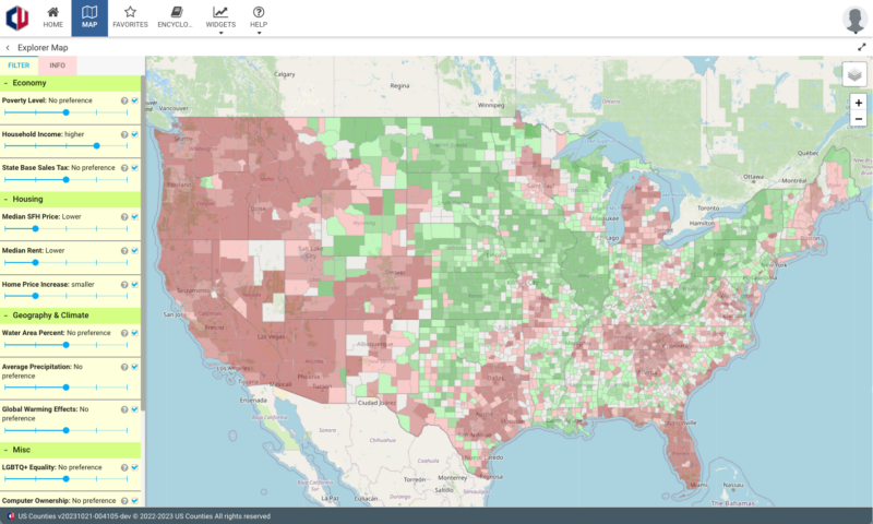
Our team loves exploring not just the new ideas, but also new places. We love it so much that we have built a whole app that helps people to discover new interesting places that fit their lifestyle and thirst for adventures.
In our US Counties project we pull data from several dozen data sources (like US Census, Wikipedia, and other pages, APIs and files) and we combine everything in one super simple to use interface. This site automatically re-pulls new data daily, so that you can always have the freshest information.
The user just needs to move the sliders in the "preference mixer" to fine-tune the preferences, and US Counties will generate an a comprehensive picture showing you the parts of the US that meet your preferences most and least.
Visualizing World Prosperity with Craftus Data Studio

What if you want to explore not only the US, but the entire world? Well, we have built something that will help you with that too!
It retrieves data from only one data source (coming from Legatum Institute Prosperity Index), but we do only because Legatum Institute already have done the bulk of the data processing work collecting data from 80+ data sources.
So we used the data they generously shared with the public and gave it a spin (literally!). With Craftus Data Studio, you adjust the contribution of different parameters similar to US Counties and preview the results in 2D, 3D, Augmented and Virtual Reality. How cool is that?!
Check out the 2D and 3D versions by clicking the button below.
Going Beyond This Reality

Speaking of Augmented and Virtual Reality, the number of VR headsets out in the wild is still relatively small, but we have something that will help you to see it in action with just your smartphone. Do this:
-
- Point your phone at that strange picture that looks like a weird QR code on the left and start the camera app.
- When prompted, open the web page.
- Allow the webpage to access your camera and sensors (this permission is only temporary, while you keep that page open)
- Keep pointing at that "Weird QR"
What do you think about what you see? BTW, just like with the normal picture, you can zoom it using pinch-in and pinch-out. Unlike a normal picture, you can also rotate it in any direction and explore from all angles.
And in the case if you are wondering what is it you are looking it, that's NASA's 2009 temperature tendency dataset (the heatmap) combined with the world's largest cities (the bars).
Ok, Back to Earth. Kinda ...

We already took a look at the virtual reality, how about we also check out around our planet. Craftus Space Analytics uses a ton of public resources to track what's going on around our beloved planet. And the reality, to be honest, is not looking pretty:
- 3 years ago we started launching objects into space at unprecedented rate.
- In 2023 2,664 objects were put into orbit - approximately 20 times more than we used to launch in average before 2016
- More than half of man-made objects in space is "space junk"
With the help of Craftus Space Analytics we hope to bring attention to this problem and develop the ultimate system for tracking space objects and preventing collisions.
This project is still work in progress and we're looking for cooperation with space agencies to finilize the interface using human-centered design (HCD).
Oh, and yes, this project will be also available in mixed reality. Imagine being in the outer space in virtual reality, how cool is that?!
Well, So You Only Build Wicked Cool 3D/AR/VR Systems?

After looking at everything shown above you may get an impression that Craftus primarily focuses on otherworldly visualizations. That's not actually the case.
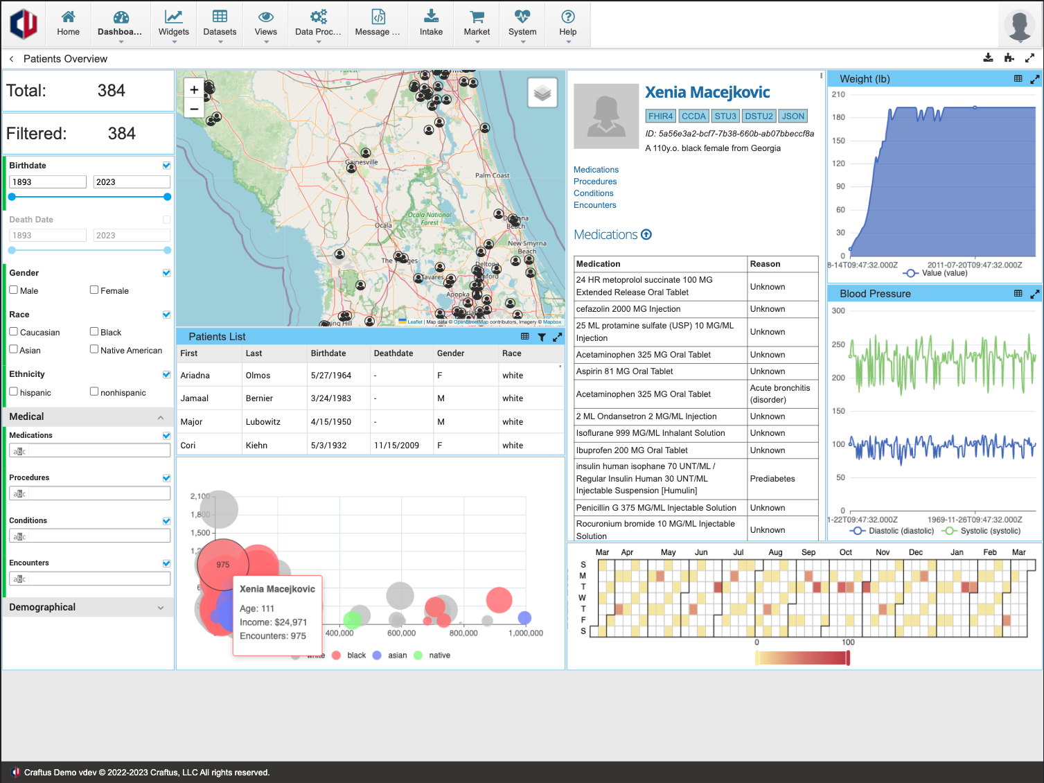
Here is an example of an we built for 411Labs, Inc - a startup focusing on data analysis for large enterprises. In this example, we developed a system that
- Integrates with multiple 3rd party products providing enterprise social collaboration and knowledge management. In this screenshot that's LumApps, Jive, Microsoft Teams, Verint, Slack and Email
- Analyzes the data and applies AI models for Sentiment Analysis to this data
- Visualizes the result via a set of highly interactive dashboards
This Is All Cool, But How Can You Help Me?
Craftus is a Software Development Company with a twist: We develop a lot cheaper and a lot faster than anyone else. We accomplish this by leveraging our proprietary platform that's unlike anything you have seen before. This totally unfair competitive advantage allows us to make a few unique offers:
- We will deliver the MVP version of your product within weeks, not months or years.
- This MVP will have functionality superseding many other products on the market.
- With this, we're ready to help fellow entrepreneurs to solve the infamous chicken and egg problem: investors won't fund a startup without an MVP and startups can't build the MVP without funding.
- If you have a great idea and need an MVP, let's discuss this. We can build you an MVP today and you will pay back once you are funded.
- And, a cherry on the top: once your MVP is built, we can refer you to some of the best investors we're connected with.
As for the established businesses, we still can help you to build an information
Any examples of other startups you helped?
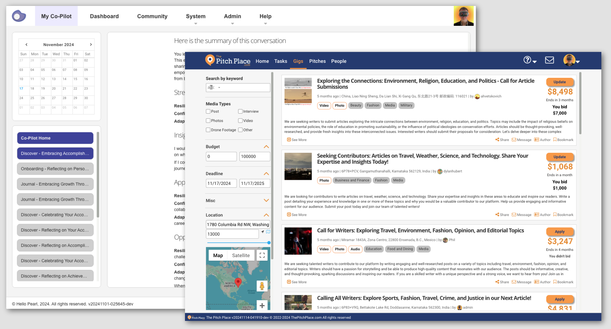
Sure! Here is a couple that recently got some publicity:
- Pearl is an AI platform to help you find your path, in both life and career.
- The Pitch Palce is the News and Media Networking Platform Designed For The Press.
- More examples are coming soon, but they are not public yet, so we're respecting their privacy.
